1.环境
系统:windows10
python版本:python3.6.1
使用的库:matplotlib,numpy
2.numpy库产生随机数几种方法
import numpy as npnumpy.random
rand(d0, d1, ..., dn) In [2]: x=np.random.rand(2,5) In [3]: x
Out[3]:
array([[ 0.84286554, 0.50007593, 0.66500549, 0.97387807, 0.03993009],
[ 0.46391661, 0.50717355, 0.21527461, 0.92692517, 0.2567891 ]])randn(d0, d1, ..., dn)查询结果为标准正态分布 In [4]: x=np.random.randn(2,5) In [5]: x
Out[5]:
array([[-0.77195196, 0.26651203, -0.35045793, -0.0210377 , 0.89749635],
[-0.20229338, 1.44852833, -0.10858996, -1.65034606, -0.39793635]])randint(low,high,size) 生成low到high之间(半开区间 [low, high)),size个数据 In [6]: x=np.random.randint(1,8,4)
In [7]: x
Out[7]: array([4, 4, 2, 7])random_integers(low,high,size) 生成low到high之间(闭区间 [low, high)),size个数据 In [10]: x=np.random.random_integers(2,10,5)
In [11]: x
Out[11]: array([7, 4, 5, 4, 2])
3.散点图
x x轴 y y轴 s 圆点面积 c 颜色 marker 圆点形状 alpha 圆点透明度 #其他图也类似这种配置N=50 # height=np.random.randint(150,180,20) # weight=np.random.randint(80,150,20) x=np.random.randn(N) y=np.random.randn(N) plt.scatter(x,y,s=50,c='r',marker='o',alpha=0.5) plt.show()
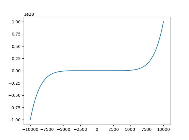
4.折线图
x=np.linspace(-10000,10000,100) #将-10到10等区间分成100份
y=x**2+x**3+x**7
plt.plot(x,y)
plt.show()
折线图使用plot函数
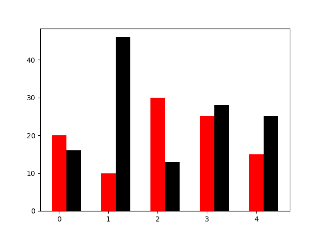
5.条形图
N=5
y=[20,10,30,25,15]
y1=np.random.randint(10,50,5)
x=np.random.randint(10,1000,N)
index=np.arange(N)
plt.bar(left=index,height=y,color='red',width=0.3)
plt.bar(left=index+0.3,height=y1,color='black',width=0.3)
plt.show()
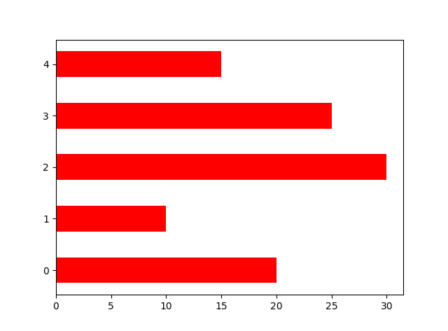
orientation设置横向条形图
N=5
y=[20,10,30,25,15]
y1=np.random.randint(10,50,5)
x=np.random.randint(10,1000,N)
index=np.arange(N)
# plt.bar(left=index,height=y,color='red',width=0.3)
# plt.bar(left=index+0.3,height=y1,color='black',width=0.3)
#plt.barh() 加了h就是横向的条形图,不用设置orientation
plt.bar(left=0,bottom=index,width=y,color='red',height=0.5,orientation='horizontal')
plt.show()
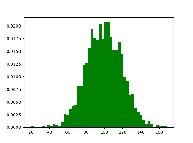
6.直方图
m1=100
sigma=20
x=m1+sigma*np.random.randn(2000)
plt.hist(x,bins=50,color="green",normed=True)
plt.show()
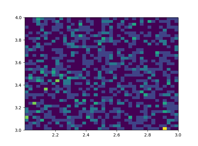
# #双变量的直方图
# #颜色越深频率越高
# #研究双变量的联合分布
#双变量的直方图 #颜色越深频率越高 #研究双变量的联合分布 x=np.random.rand(1000)+2 y=np.random.rand(1000)+3 plt.hist2d(x,y,bins=40) plt.show()
7.饼状图
#设置x,y轴比例为1:1,从而达到一个正的圆#labels标签参数,x是对应的数据列表,autopct显示每一个区域占的比例,explode突出显示某一块,shadow阴影labes=['A','B','C','D'] fracs=[15,30,45,10] explode=[0,0.1,0.05,0] #设置x,y轴比例为1:1,从而达到一个正的圆 plt.axes(aspect=1) #labels标签参数,x是对应的数据列表,autopct显示每一个区域占的比例,explode突出显示某一块,shadow阴影 plt.pie(x=fracs,labels=labes,autopct="%.0f%%",explode=explode,shadow=True) plt.show()

8.箱型图
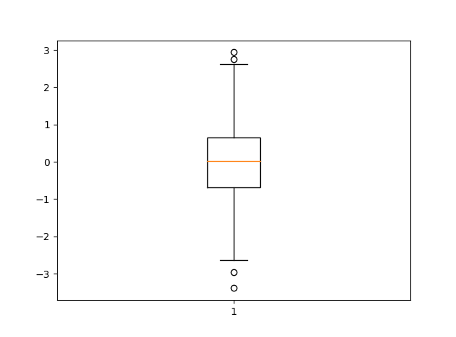
import matplotlib.pyplot as plt
import numpy as np
data=np.random.normal(loc=0,scale=1,size=1000)
#sym 点的形状,whis虚线的长度
plt.boxplot(data,sym="o",whis=1.5)
plt.show()
#sym 点的形状,whis虚线的长度
 来源:https://my.oschina.net/u/3264690/blog/915068
原文链接:python数据可视化----绘制各种图形,转载请注明来源!